Branding for a Cause
One of the projects for my Visual Communications and Advocacy class was "Branding for a Cause." The goal of this project was to carefully amplify a message in order to reach more people through analyzing one's audience, clarifying one's message, and effectively applying visual tone. For my cause, I chose to focus on educating elementary school students on the importance of diversity, equity, and inclusion through the love of food and international cuisines.
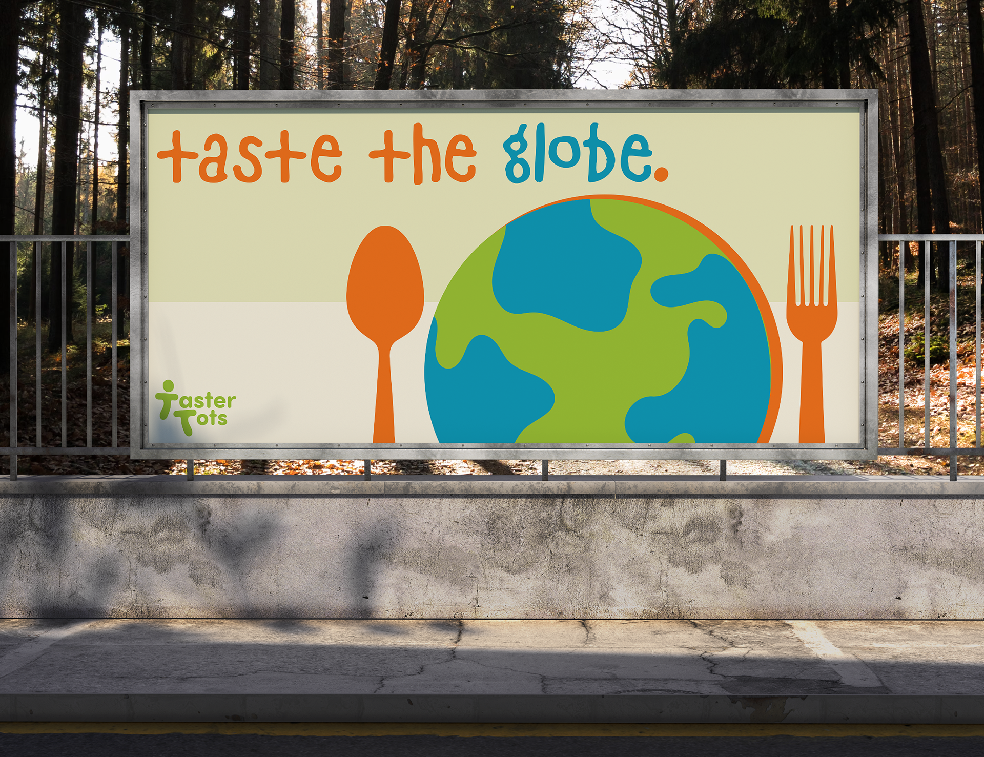
For my moodboard, I wanted to embody the designs of a classic, traditional textbook with the round edges and minimalist graphics. With the color scheme, I decided on bright vibrant colors of orange, blue, and orange to signify the childhood memories and evoke feelings of positivity and excitement.
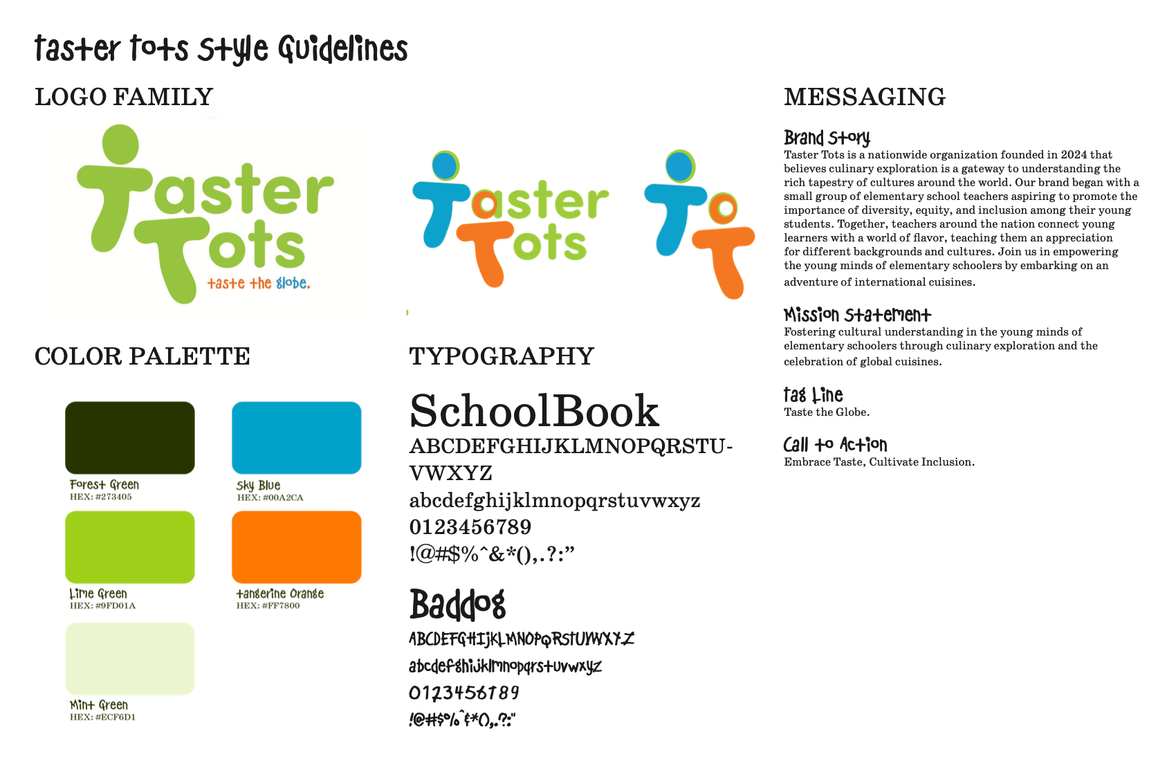
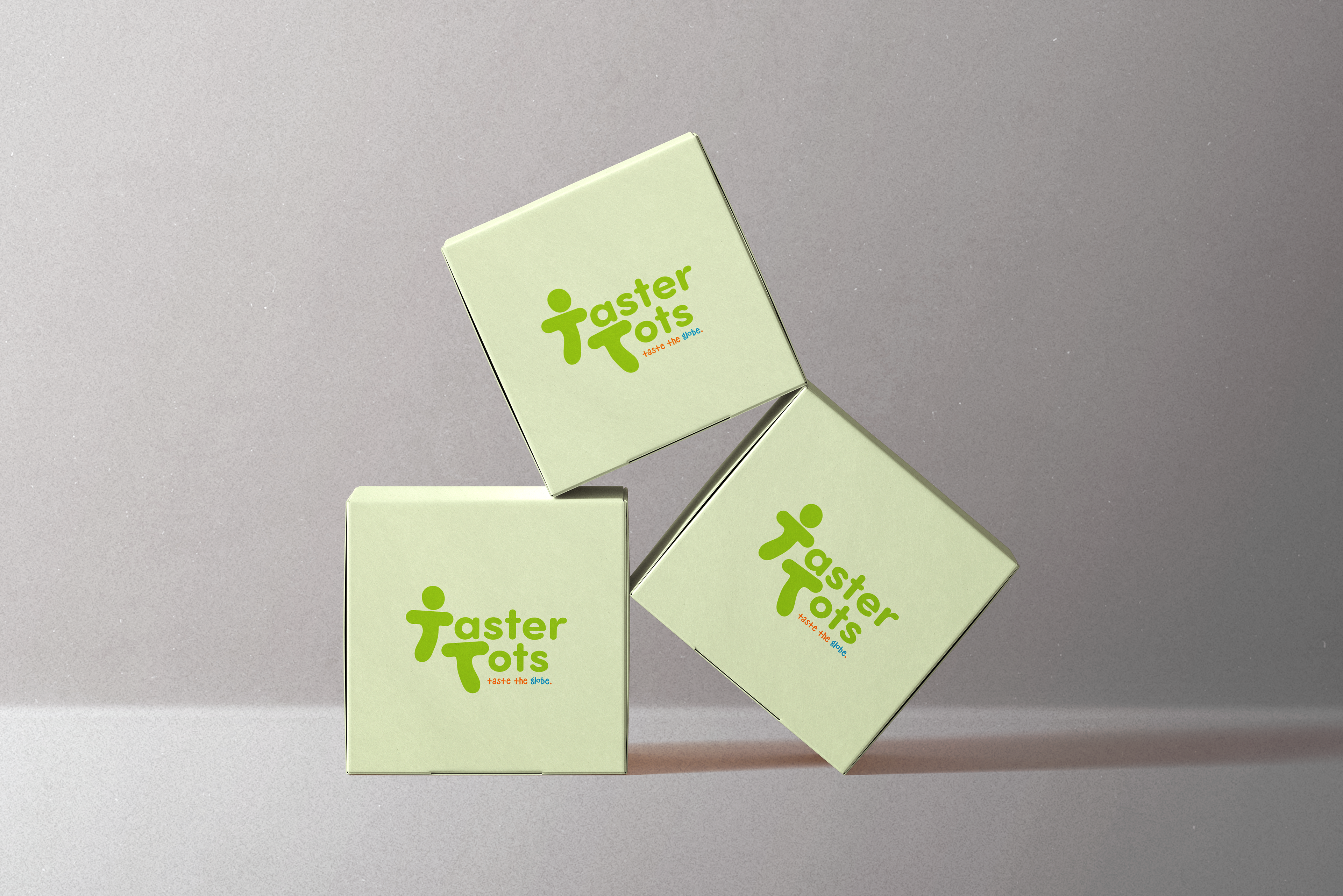
The Style Guideline for my brand, "Taster Tots," included three variations of my logos, where one contains the slogan, one compasses the three main colors of the brand, and the last represents a simplified version. "Taster Tots" color palette utilizes the colors of my moodboard with green having multiple accents. For the typography, I decided upon fonts that highlights the essence of a textbook and schoolwork given to elementary schoolers.
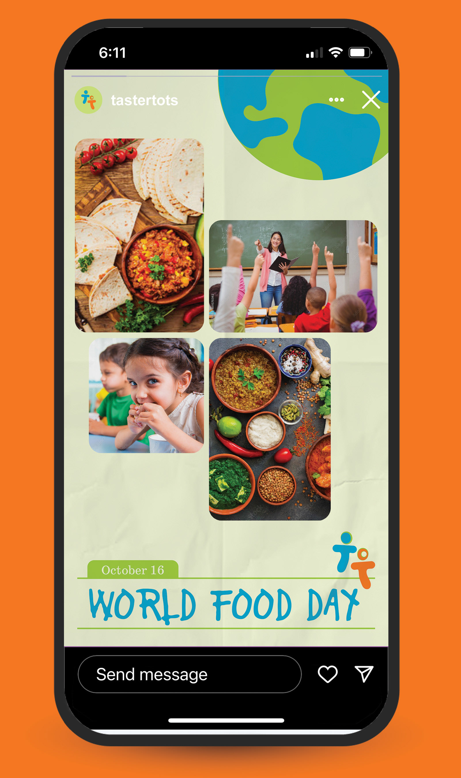
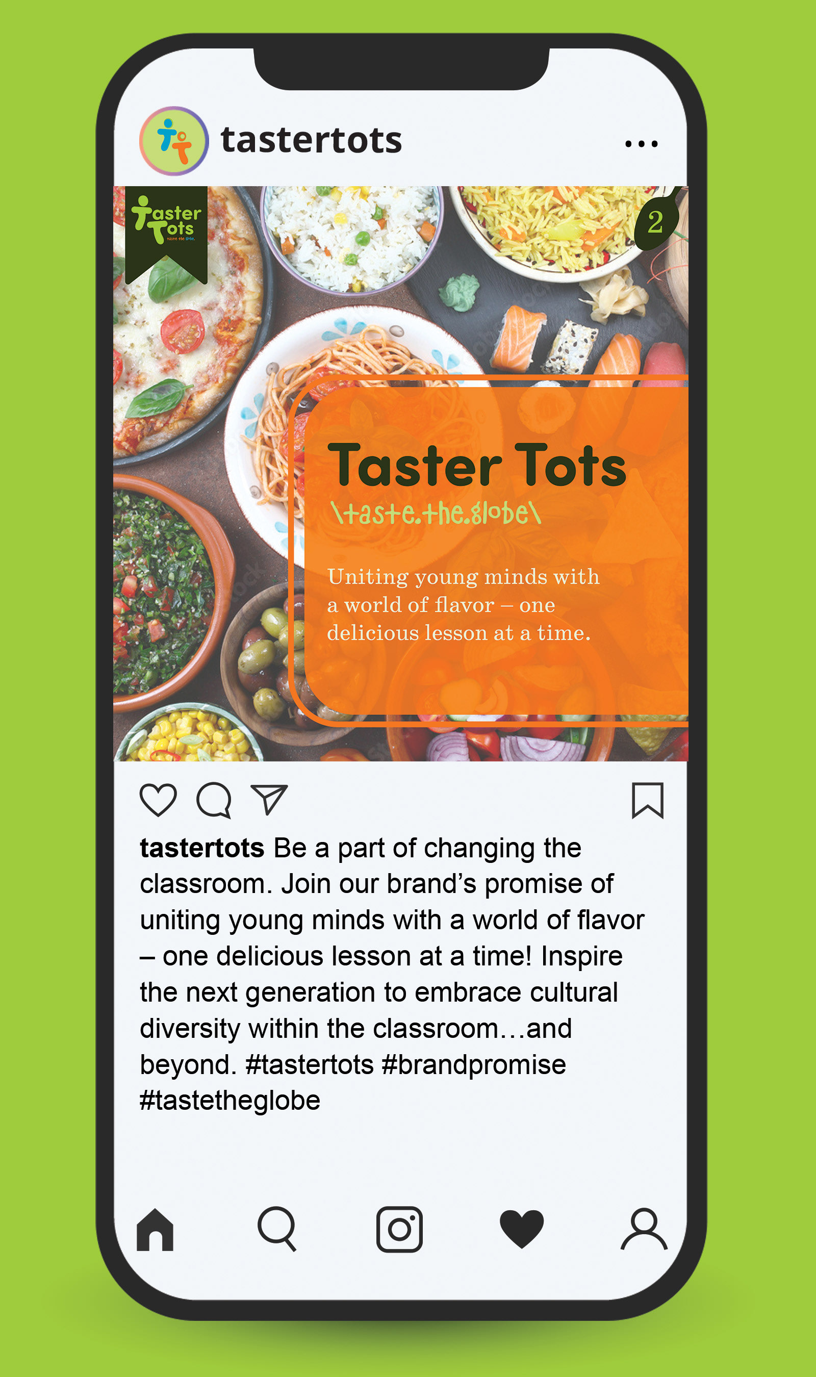
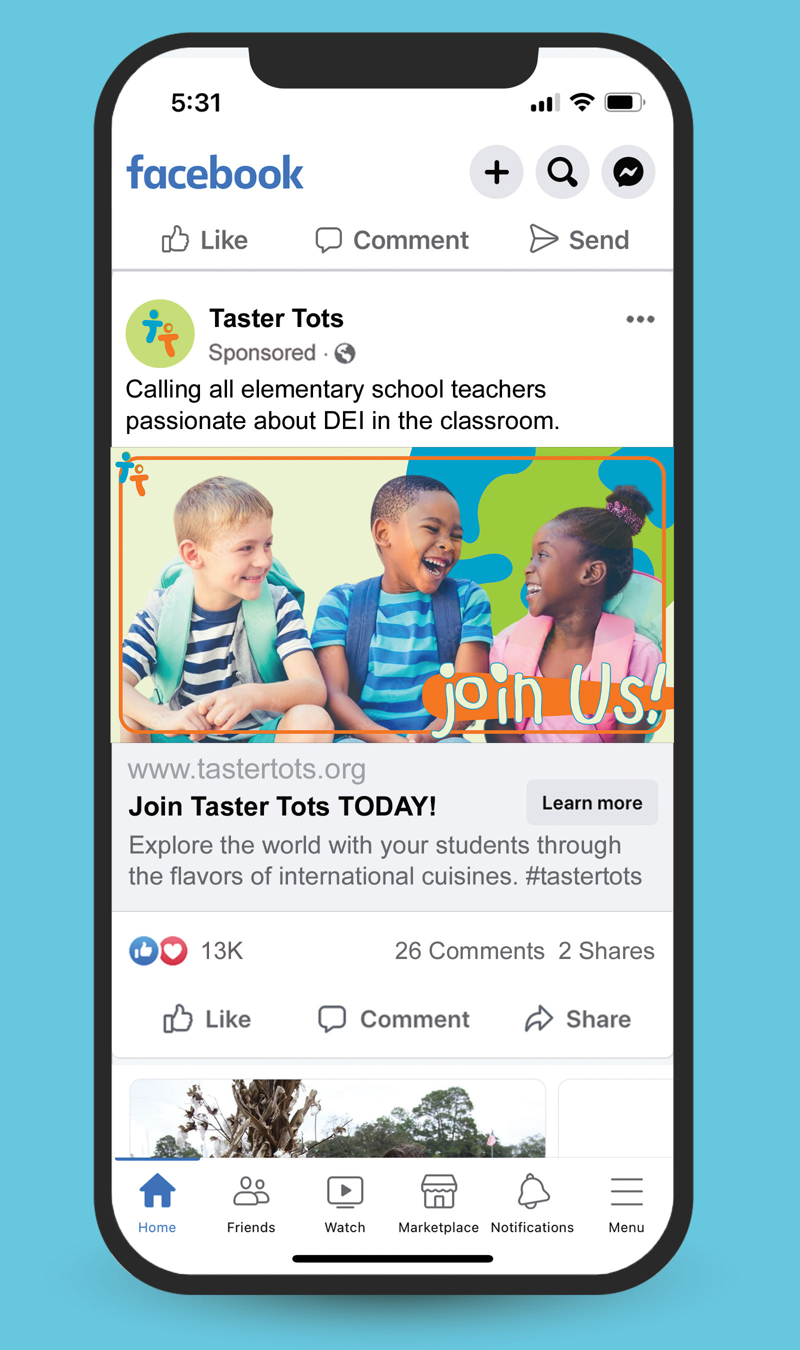
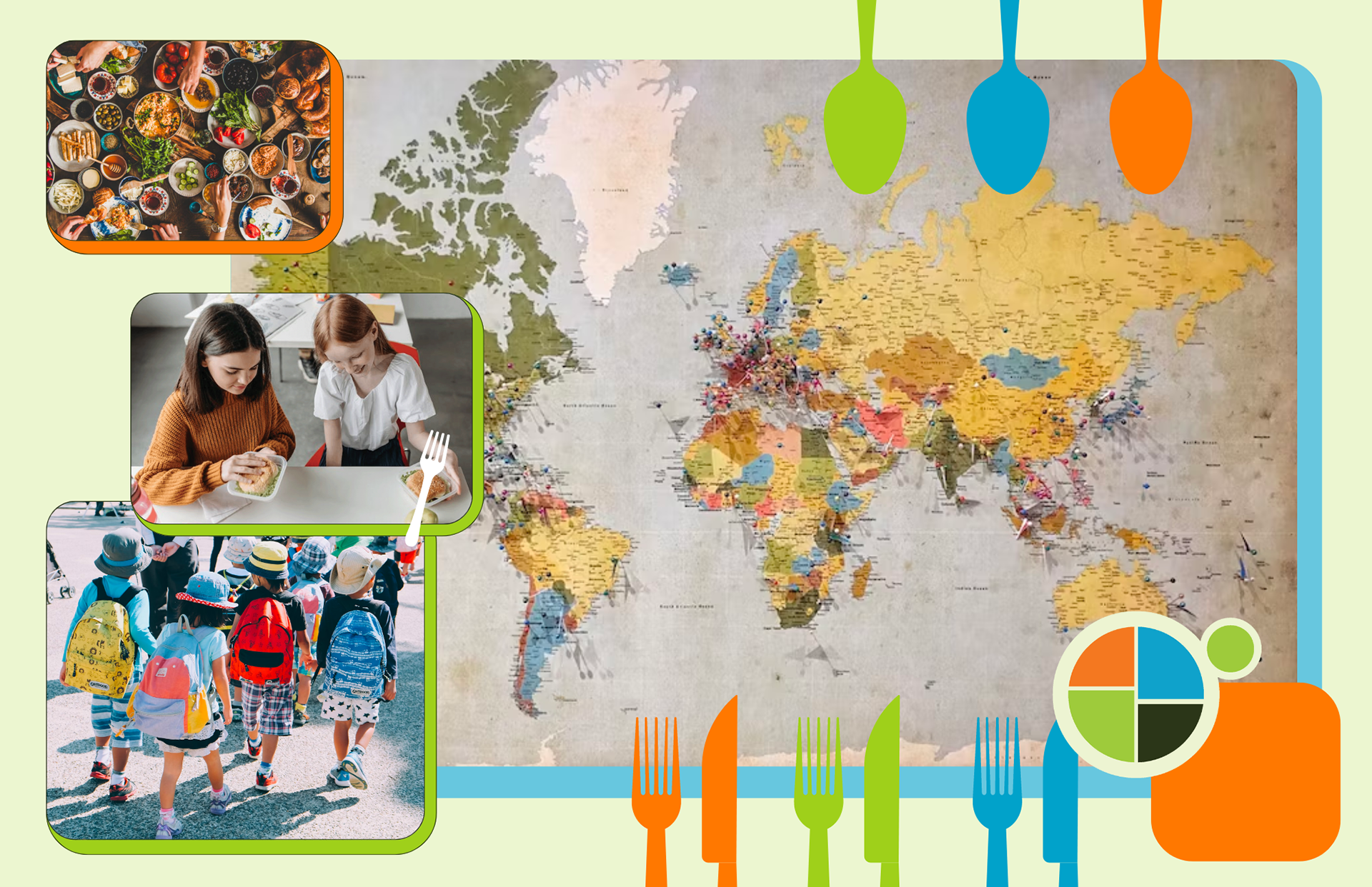
For the social media, I created graphics for a Instagram story, a Instagram post, and a Facebook post. My goal was for the graphics to illuminate an educational, textbook-style to attract the attention of elementary school teachers. I wanted the visual graphics to feature teachers, kids, or a variety of food to encourage teachers to participate in Taster Tots to foster cultural understanding in the young minds of elementary schoolers.
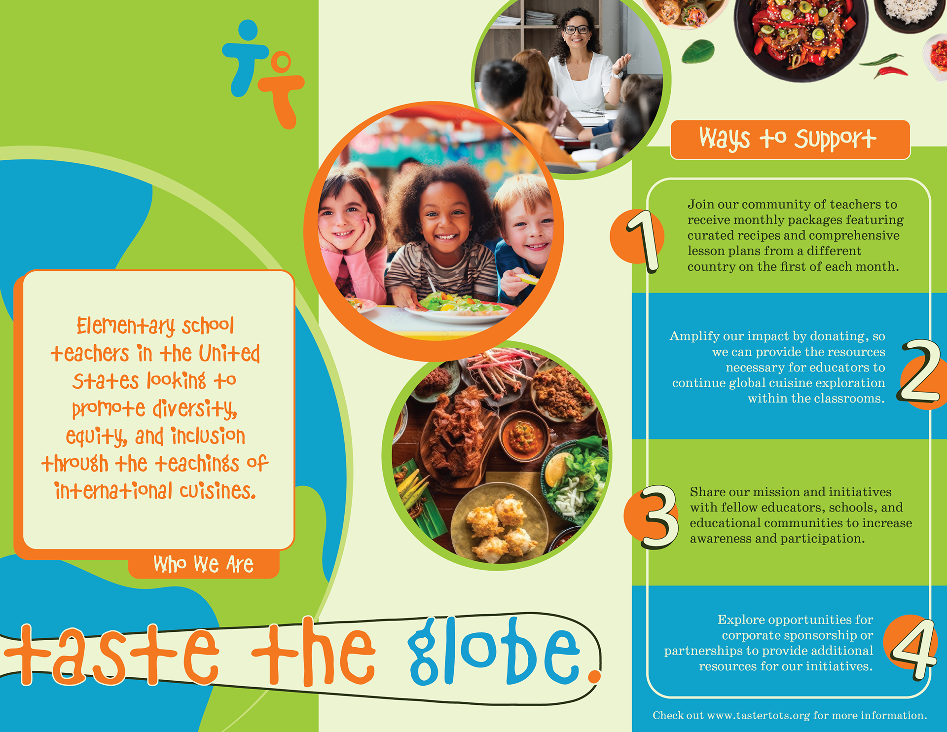
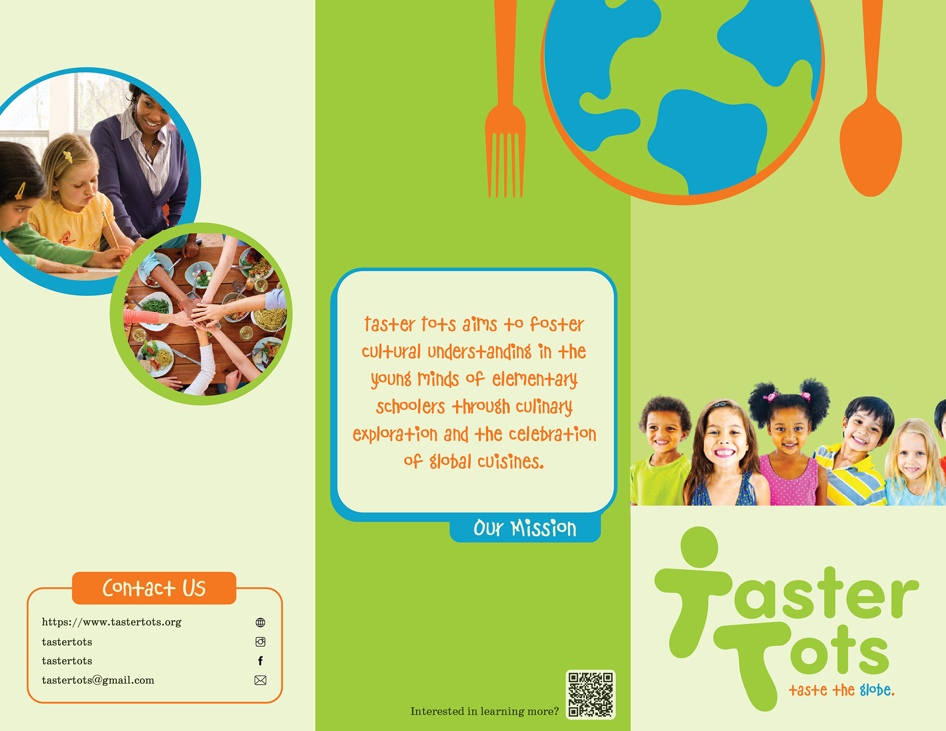
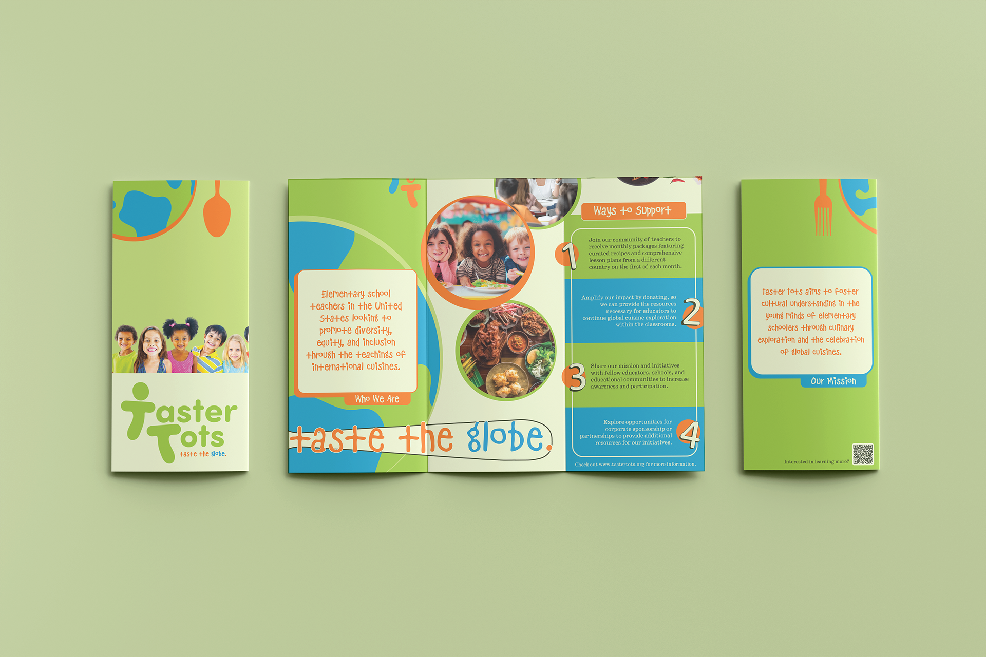
To provide a detailed reference and explanation of the purpose of Taster Tots, I designed a brochure where the information advertised ways to support the organization, the mission statement, the slogan, and who makes up the bulk of Taster Tots.